Levadura Madre
A market-hall bakery stall getting its own shopfront needed a name and a mark that could work on a sourdough tag and a delivery van alike.
IDENTITY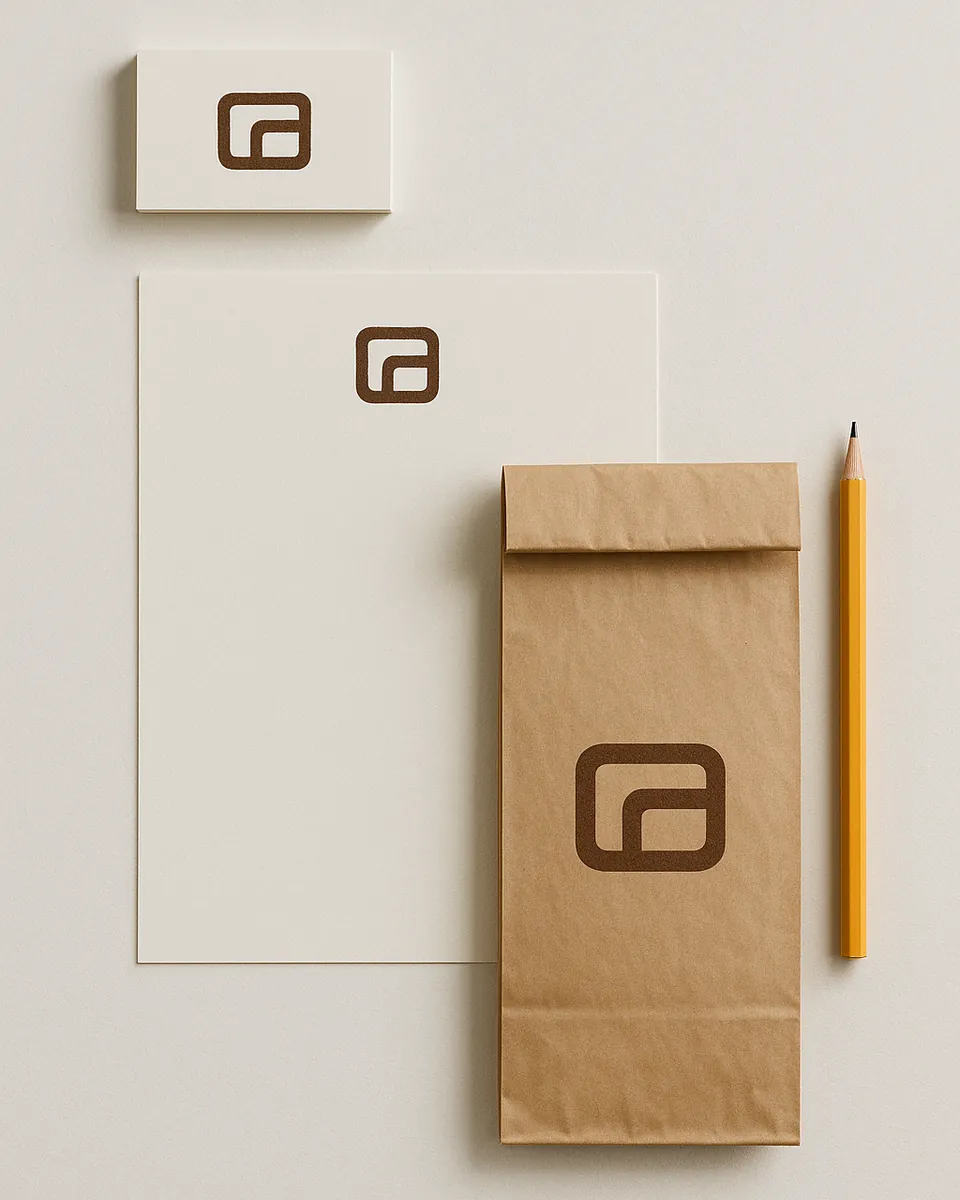
The problem
The stall had no name of its own, just 'Panadería' painted above the counter, same as six other stalls in the same market hall. Regulars knew which one by memory, not by sign. Moving to a standalone shop meant that stopped working: strangers needed a reason to walk in, and 'the bakery near the fish stall' doesn't fit on an awning.
The approach
Naming came first. I tried the obvious routes (surnames, 'artesano,' 'horno de,' the usual bakery vocabulary) and landed on Levadura Madre instead: 'mother starter,' the thing that actually makes the bread what it is, and a small pun on 'madre' that Spanish speakers catch immediately.
The mark is drawn from the fold of a laminated dough: one continuous line, doubled back on itself, which reads as an L from a distance and as dough up close. It had to survive being stamped onto a kraft bag in one colour, so the line stayed thick and the details stayed out.
The system runs on two weights of one typeface, a warm off-white and a single deep flour-brown, applied consistently across the bag, the box, the awning lettering and a small rubber stamp used on invoices: the kind of detail a one-person bakery can actually use without hiring anyone else.
What I made
- Naming direction & rationale
- Logo & mark variations
- Colour and type system
- Bag and box packaging
- Awning / signage concept
- One-page brand guidelines