Cala
A three-product skincare line made in small batches needed packaging that could sit on a bathroom shelf without shouting 'natural' at everyone who walks past.
PACKAGING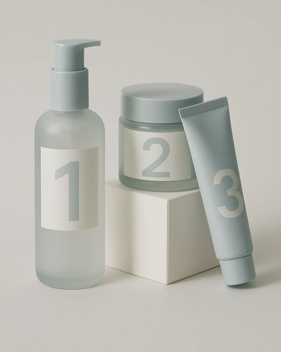
The problem
The kraft-paper-and-brown-glass look is everywhere in small-batch skincare right now: it's shorthand for 'natural' that's stopped meaning much because every brand uses it. In this brief the product is genuinely small-batch: one maker, one kitchen, numbered batches. The packaging needed to say that without leaning on the visual cliché that usually stands in for it.
The approach
Instead of kraft and rustic type, the direction went quieter: a pale, cool bottle colour, one restrained typeface, and the batch number treated as the actual design detail, printed large, not hidden on the bottom like an afterthought.
The label system had to work identically across a glass jar, a pump bottle and a tube, at three very different sizes, without redrawing anything from scratch each time: one grid, three applications.
The gift box folds flat for storage between batches and opens to show all three products sitting in a single row, which mattered more to this brand than a flashy unboxing moment: most of these get bought as a set, once.
What I made
- Label & bottle design
- Box and gift-set design
- Batch-code system
- Print production spec sheet